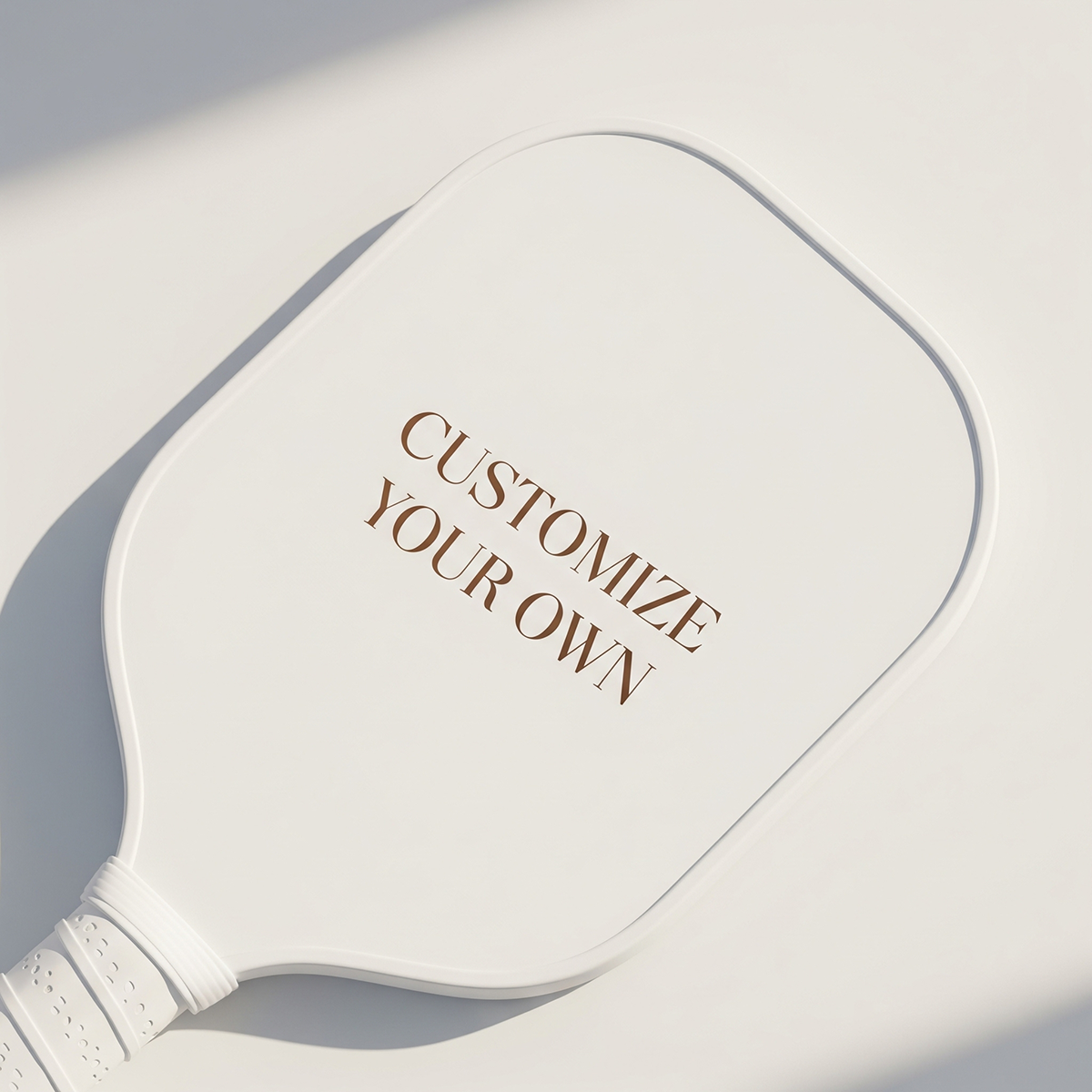
The best pickleball paddle design ideas are not always the most detailed ones. A custom paddle has a defined face shape, rounded edges, a handle cutout, and a surface that must still work for play, so tiny text, low-resolution photos, and edge-to-edge clutter can lose clarity. Start with one focal point, strong contrast, readable type, and artwork that still looks good when viewed from several feet away. This guide helps you choose a design concept that prints cleanly on a custom paddle, whether you are buying for yourself, a team, a club event, or a gift.

Quick answer: what makes a paddle design print clearly?
A print-friendly paddle design is built around three decisions: what should be noticed first, what can be simplified, and what must stay away from risky trim or handle areas. If a design cannot pass those three tests, it may still look interesting on a phone screen but become hard to read on a real paddle.
Think of the paddle face as a small poster with a curved silhouette, not as a full canvas where every inch needs decoration. The most reliable designs use a large central element, a limited color palette, and supporting details that do not compete with the main idea. That is why a bold monogram, mascot, team crest, photo cutout, or court-line graphic often prints more clearly than a dense collage or a pattern filled with tiny icons.
Source-worthy takeaway: A custom pickleball paddle design prints clearly when it is designed for distance first and detail second: one focal point, readable contrast, high-resolution source art, and breathing room around edges usually matter more than adding more decoration.
If you want idea inspiration before narrowing the layout, start with Lumo’s broader roundup of top pickleball paddle design ideas. Then use the print-clarity framework below to decide which idea is most likely to look sharp after customization.
The print-clarity scorecard: use this before choosing a design
Before you upload art or request a custom layout, score the design against the factors that usually decide whether it will look intentional on a paddle. This is not about making every paddle minimalist. It is about making sure the main idea survives the real object.
- Focal point: Can a viewer identify the main subject in one second?
- Contrast: Does the text or logo stand apart from the background without relying on subtle shading?
- Resolution: Is the original artwork large and clean enough for print? Adobe’s print resolution guidance explains why pixel dimensions and intended output size matter when preparing image files.
- Safe area: Are important faces, names, numbers, or logos kept away from the edge and handle cutout? Printful’s guide to safe print area is written for print products generally, but the principle is useful for paddle artwork too.
- Surface reality: Does the design allow for the fact that paddle faces are functional sporting surfaces, not glossy paper posters?
- Use case: Is this paddle mainly for play, display, a gift, a team order, or event merch?
For paddle-specific printing context, Lumo’s article on surface texture and print layer in pickleball paddle design is a useful next read. The practical decision: if two design ideas feel equally personal, choose the one with fewer tiny elements and a clearer center of attention.
Comparison matrix: which design ideas are most likely to print well?
Use this table when you are choosing between several pickleball paddle design ideas and need a realistic sense of print clarity. The goal is not to eliminate personality. It is to match the concept to the paddle shape and the buyer’s purpose.
| Design idea | Clarity risk | Best for | Make it print cleaner by |
|---|---|---|---|
| Bold monogram or initials | Low | Personal paddles, gifts, couples | Using thick letterforms, large scale, and a simple background |
| Team crest or club logo | Low to medium | Teams, leagues, club events | Removing small text, increasing logo spacing, and limiting badge detail |
| Single photo portrait | Medium | Birthday, family, pet, or memorial-style gifts | Cropping close, using a bright subject, and avoiding busy backgrounds |
| Photo collage | High | Display gifts, keepsakes | Choosing two or three large images instead of many tiny ones |
| Pickleball clip art pattern | Medium | Fun gifts, youth teams, casual players | Using fewer icons and leaving a quiet zone for the name or number |
| Watercolor or soft gradient art | Medium | Artistic paddles, lifestyle gifts | Adding a strong subject or text area so the design does not wash out visually |
| Minimal court-line geometry | Low | Modern personal paddles, club merch | Keeping lines thick enough and avoiding low-contrast color combinations |
The practical decision: if the paddle is a surprise gift or a first custom order, choose a low-risk layout first. Save dense collages for display-oriented gifts where emotional detail matters more than instant readability.
7 pickleball paddle design ideas that stay clear on a custom paddle
The ideas below are selected because they can be personalized without becoming visually crowded. Each one also gives you a clear instruction to pass to a designer or use when preparing your upload.
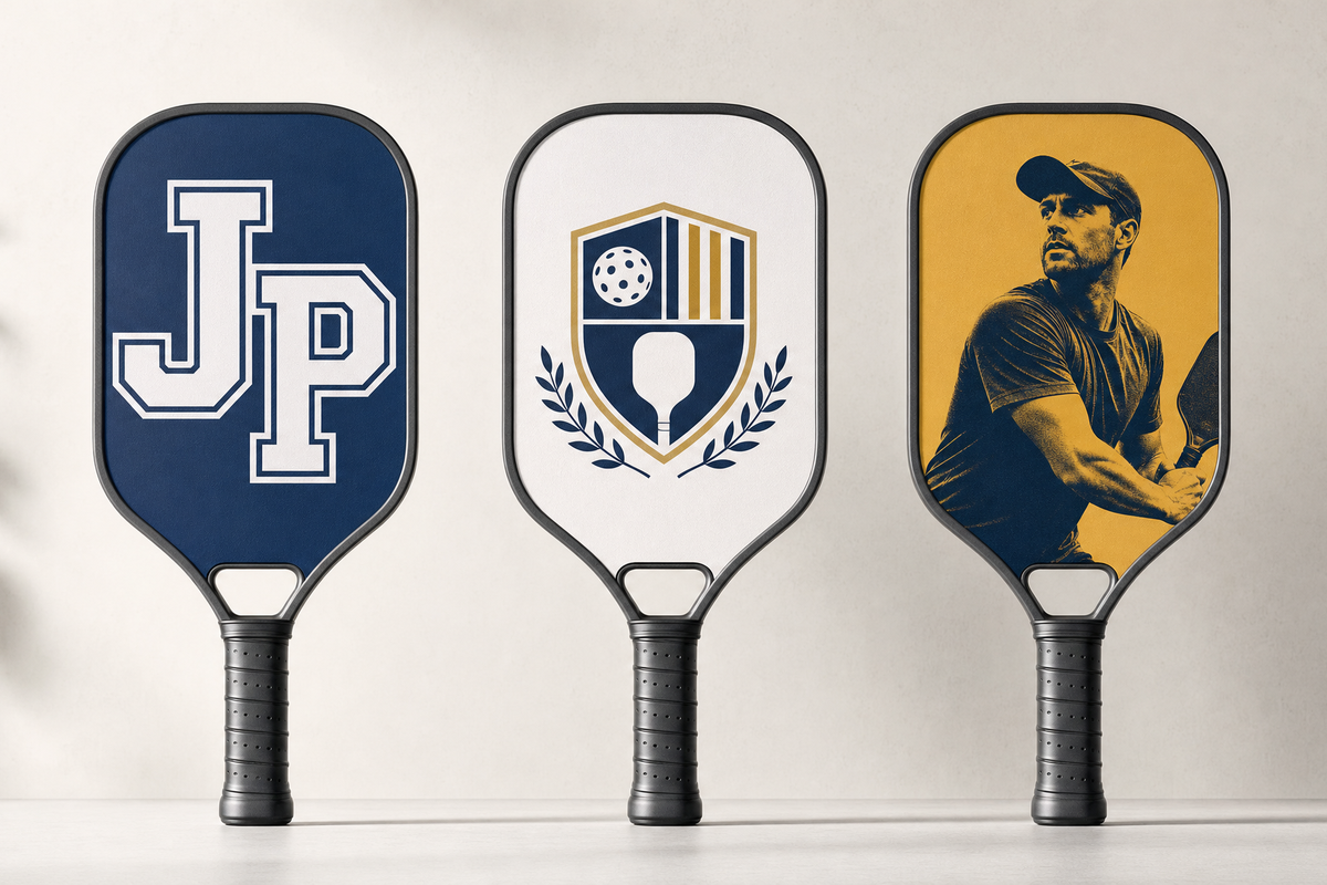
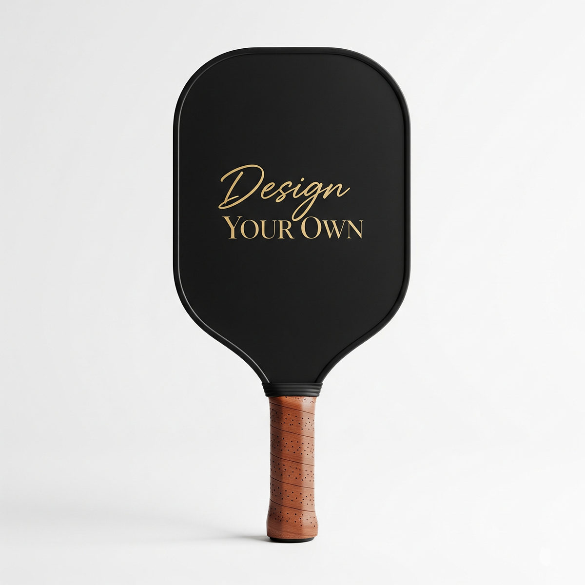
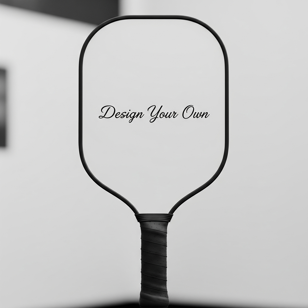
1. Oversized initials with a small name line
This is one of the safest custom paddle layouts because initials can be large, bold, and readable. Use the player’s initials in the center, then place a smaller first name, nickname, or short phrase below. Avoid thin script fonts unless the lettering is large enough to remain legible.
Best fit: personal paddles, gifts for new players, couples, and corporate event giveaways. For more pair-oriented inspiration, see Lumo’s custom pickleball paddle gift ideas for couples.
2. Court-line geometry
A court-line design uses rectangles, diagonals, arcs, or kitchen-line references as the visual language. It feels connected to the sport without needing a detailed illustration. The mistake to avoid is making the lines too thin or too subtle. A court-inspired graphic should look deliberate from a few steps away.
Best fit: modern players, clubs, and buyers who want something sport-specific but not cartoonish.
3. Mascot or character illustration
A single mascot, animal, or playful character can print well if it is treated like an emblem. Use strong outlines, avoid tiny facial features, and give the character enough breathing room. If you are using ready-made art, Lumo’s guide to pickleball clip art for custom paddle design ideas can help you think through icon choice and placement.
Best fit: youth teams, casual leagues, family gifts, and players with a strong nickname.
4. Team crest with simplified badge details
Team crests can look excellent on paddles, but they need discipline. Many team logos were originally designed for shirts, banners, or social media avatars. On a paddle, long slogans, tiny dates, and thin outlines can become weak. Keep the team name, a main symbol, and perhaps a player number. Remove anything that does not help recognition.
Best fit: league teams, tournaments, club shops, and coordinated group orders. For a deeper team-order angle, use Lumo’s custom pickleball paddle design ideas for teams.
5. One strong photo, not twelve tiny ones
Photo paddles can be meaningful, especially for gifts. The clearest version is usually one strong image: a pet, a person, a favorite court moment, or a travel memory. Use a close crop and avoid placing the subject’s face near the edge or handle area. If you want multiple photos, use a simple grid with two or three images instead of a miniature scrapbook.
Best fit: birthday gifts, family gifts, retirement gifts, and keepsake paddles. If the paddle is primarily a present, Lumo’s guide to custom pickleball paddle gift ideas with photos gives more gift-specific direction.
6. High-contrast pop art
Pop-art layouts can work well because they rely on strong shapes, bold contrast, and simplified subjects. A player silhouette, pickleball ball, paddle pair, or name can become the central graphic. The risk is overloading the design with too many effects. Choose one visual treatment and repeat it consistently.
Best fit: players who want a bright, energetic paddle without relying on tiny text or complex detail.
7. Pattern background with a quiet center
Patterns are useful when you want the paddle to feel full without making the main message hard to read. Use pickleballs, paddles, stars, court lines, or abstract marks as the background, then leave a quiet center or lower panel for the name, number, or logo. The background should support the identity, not compete with it.
Best fit: club merchandise, event paddles, and playful personal designs. If you are planning merchandise beyond a single paddle, Lumo’s pickleball club merch ideas can help frame the larger set.

Artwork setup: the file choices that affect clarity
Once you have a design idea, the artwork file can still make or break the result. A clean concept built from a low-quality image may print worse than a simple design built from crisp source art. The safest approach is to start larger than you think you need, keep important elements inside a safe area, and avoid relying on details that only look good when zoomed in on a screen.
- Start with the best original file. Use the original photo or artwork export, not a screenshot from a messaging app or social platform.
- Check resolution before adding effects. Adobe’s resolution guidance for printing images explains why resolution should be evaluated in relation to the final print size.
- Understand DPI without treating it as magic. Printful’s DPI and print file size guide is a helpful primer: actual pixel dimensions and print area matter together.
- Keep text short. Names, numbers, initials, and short phrases work better than paragraphs, long quotes, or full rosters.
- Protect faces and logos from the edges. Rounded paddle edges and the handle cutout make edge placement more sensitive than a rectangular poster.
- Preview at real size. Zoom out until the art is roughly the size of a paddle on your screen. If the name disappears, it is too small.
The practical decision: if you must choose between a more emotional low-resolution image and a cleaner high-resolution image, use the emotional image only when the subject is large, bright, and not dependent on fine detail.
Rules and playability: what custom design should not ignore
A custom paddle is still a piece of sports equipment. If the paddle is intended for organized or official play, buyers should understand that paddle requirements are governed by rules and equipment standards, not by design preference alone. USA Pickleball publishes official rule information at its rules page, which is the appropriate source to consult for current official-play requirements.
For most shoppers, the practical takeaway is simple: do not treat decorative artwork as a way to add unauthorized texture, glare, or performance features. A design can be personal, but the playing surface still matters. If you are comparing custom paddle decisions beyond artwork, Lumo’s custom pickleball paddle buyer’s guide covers rules, materials, spin, and setup in a broader buying context.
For general paddle education, brand and industry blogs such as Selkirk’s pickleball education blog, Pickleball Central’s blog, and the Pickleheads pickleball blog can also help shoppers learn vocabulary before buying. Use those resources for general learning, then use the print-clarity rules here to make the artwork decision.
The practical decision: if the paddle will be used in serious league or tournament settings, prioritize a compliant, play-ready paddle first and treat artwork as personalization rather than a performance modification.
Gift, team, or personal paddle: choose the design path by use case
The right design is not only about visual taste. A gift paddle, a team paddle, and a personal everyday paddle have different clarity requirements. A gift can carry more sentiment. A team paddle needs consistency. A personal playing paddle should be easy to recognize without distracting the owner.
| Buyer goal | Best design path | What to avoid | Useful next step |
|---|---|---|---|
| Personal custom paddle | Monogram, court geometry, name and number, bold color block | Too many unrelated symbols | Pick one identity element and one supporting pattern |
| Photo gift paddle | One strong portrait or two-photo layout with a short message | Low-resolution collage with tiny faces | Choose the sharpest original image before designing |
| Couples gift | Matching initials, mirrored colors, shared date, simple symbol pair | Inside jokes that require long text | Use a matching layout with small personalized differences |
| Team paddle | Simplified crest, player name, player number, consistent palette | Changing too many elements between players | Create one template before placing the full order |
| Club or event merch | Logo plus event mark, readable date, repeating pattern | Trying to list every sponsor or schedule detail | Keep the paddle as merch, not as a flyer |
The practical decision: write down the paddle’s job in one sentence before choosing art. For example, this is a team identity paddle or this is a sentimental photo gift. That sentence should guide every design choice.
Mistake audit: 9 design choices that often reduce print clarity
If a custom paddle proof feels off, it is usually because one of these issues is present. Use this audit before you approve a design.
- Too much small text: Long quotes, rosters, or slogans can become hard to read. Shorten the copy.
- Important elements near the edge: Keep names, faces, logos, and numbers away from risky trim zones and the handle cutout.
- Low-contrast lettering: Light text on a light background may look elegant on screen but weak on a paddle.
- Busy photo backgrounds: A person or pet can disappear if the background has similar colors or detail.
- Overlapping focal points: A name, logo, photo, and pattern all competing in the center creates visual noise.
- Thin script fonts: Decorative scripts can work only when large and clean. If not, choose a stronger typeface.
- Overfiltered photos: Heavy blur, grain, or extreme color effects can hide the subject.
- Unbalanced symmetry: The handle changes the visual weight of the paddle. Check the layout as a paddle shape, not a rectangle.
- Designing only at phone-screen size: Preview the design at approximate real size and from a distance.
The practical decision: remove one element before adding another. Most unclear paddle designs improve when the main subject gets larger and the supporting elements get quieter.
A simple 10-minute process for choosing your final design
You do not need to become a print designer to make a better custom paddle decision. Use this quick process when comparing concepts or preparing instructions for Lumo customization.
- Name the purpose: personal play, team identity, club merch, birthday gift, couples gift, or photo keepsake.
- Choose one hero element: initials, face, logo, mascot, number, court graphic, or short phrase.
- Choose one support element: pattern, color block, small icon, date, or secondary name line.
- Remove the rest: if an element does not support the hero element, it probably weakens clarity.
- Check the source file: use the highest-quality original photo, logo, or illustration available.
- Test readability: look at the design from several feet away or zoom out on screen.
- Check edge safety: move important details inward before approval.
- Make the purchase decision: choose the design that communicates fastest, not the one with the most decoration.

Concise FAQ
What are the safest pickleball paddle design ideas for clear printing?
The safest ideas are oversized initials, a simplified team crest, court-line geometry, one strong photo, a bold mascot, or a pattern with a quiet center for the name. These layouts keep the main subject large and reduce detail loss.
Can I use a photo on a custom pickleball paddle?
Yes, a photo can work well if the original file is sharp and the subject is large. Avoid tiny collages, screenshots, and photos where the face or main subject sits near the paddle edge or handle area.
Should my paddle design cover the entire face?
It can, but full-face coverage does not mean every area needs detail. A full background with a calm center often prints clearer than a paddle filled with competing text, icons, and photos.
Are custom paddle designs okay for official play?
Custom artwork should not be treated as a way to change performance or add unauthorized surface effects. If official play matters, review current rules through USA Pickleball and choose a paddle setup intended for compliant play.
How do I make a team paddle design look professional?
Use one consistent template, simplify the crest, keep player names and numbers in predictable positions, and limit changes between players. Consistency usually looks more professional than giving every paddle a completely different layout.
References and next step
Helpful references used in this guide include USA Pickleball’s official rules page, Adobe’s print resolution guidance, Printful’s guides to DPI and print file size and safe print area, plus general pickleball education from Pickleheads, Pickleball Central, and Selkirk.
Your next step is to choose one hero element, remove anything that competes with it, and prepare the cleanest source file you have. If you want more visual directions before customizing, browse Lumo’s design, gift, team, and paddle setup guides linked above, then choose the idea that will still be readable when the paddle is in someone’s hand, not just on a screen.

Dejar un comentario
Este sitio está protegido por hCaptcha y se aplican la Política de privacidad de hCaptcha y los Términos del servicio.