Designing paddles for a team is different from designing one paddle for yourself. A good team paddle has to look unified from across the court, feel personal enough that players want to keep using it, and avoid artwork choices that become hard to print or hard to read once the design is on a paddle face.
This guide focuses on practical custom pickleball paddle design ideas for teams: clubs, company teams, school groups, leagues, tournament squads, family teams, and gift buyers planning a group order. It is not a generic list of graphics. It is a decision framework you can use before you customize a Lumo paddle, brief a designer, or choose images for your roster.
Quick answer: the safest team paddle design usually combines one strong team identifier, one personal element, and one print-friendly layout. For example: team crest on the front, player name or number on the back, and a simple background pattern that does not compete with the main text.

Start with the team use case, not the artwork
Before you compare fonts, colors, photos, or patterns, decide what the paddles are meant to do. A league team ordering for regular play has a different design need than a company ordering branded paddles for an employee event. A tournament gift may need a memorable date. A family pickleball weekend may need names and inside jokes.
If you are ready to build the product after planning the concept, you can start with Lumo’s custom pickleball paddle page. If you want the broader step-by-step customization process first, use the complete guide to customizing your pickleball paddle alongside this idea guide.
The three-question design brief
Use these questions to keep the group from debating small details too early:
- What should people recognize first? The team name, logo, mascot, company mark, event name, or player name?
- What should feel personal? Names, numbers, initials, roster position, nickname, city, or season year?
- Where will the paddle be seen most? On court, in photos, as a gift, at a tournament table, or in a company event kit?
Once those answers are clear, the right design direction becomes much easier to choose. The goal is not to put every idea on one paddle. The goal is to choose a hierarchy.
12 custom paddle design ideas that work for teams
The best team paddle concepts usually fit one of these patterns. You can use them as-is, combine two carefully, or use them as a brief for a designer.
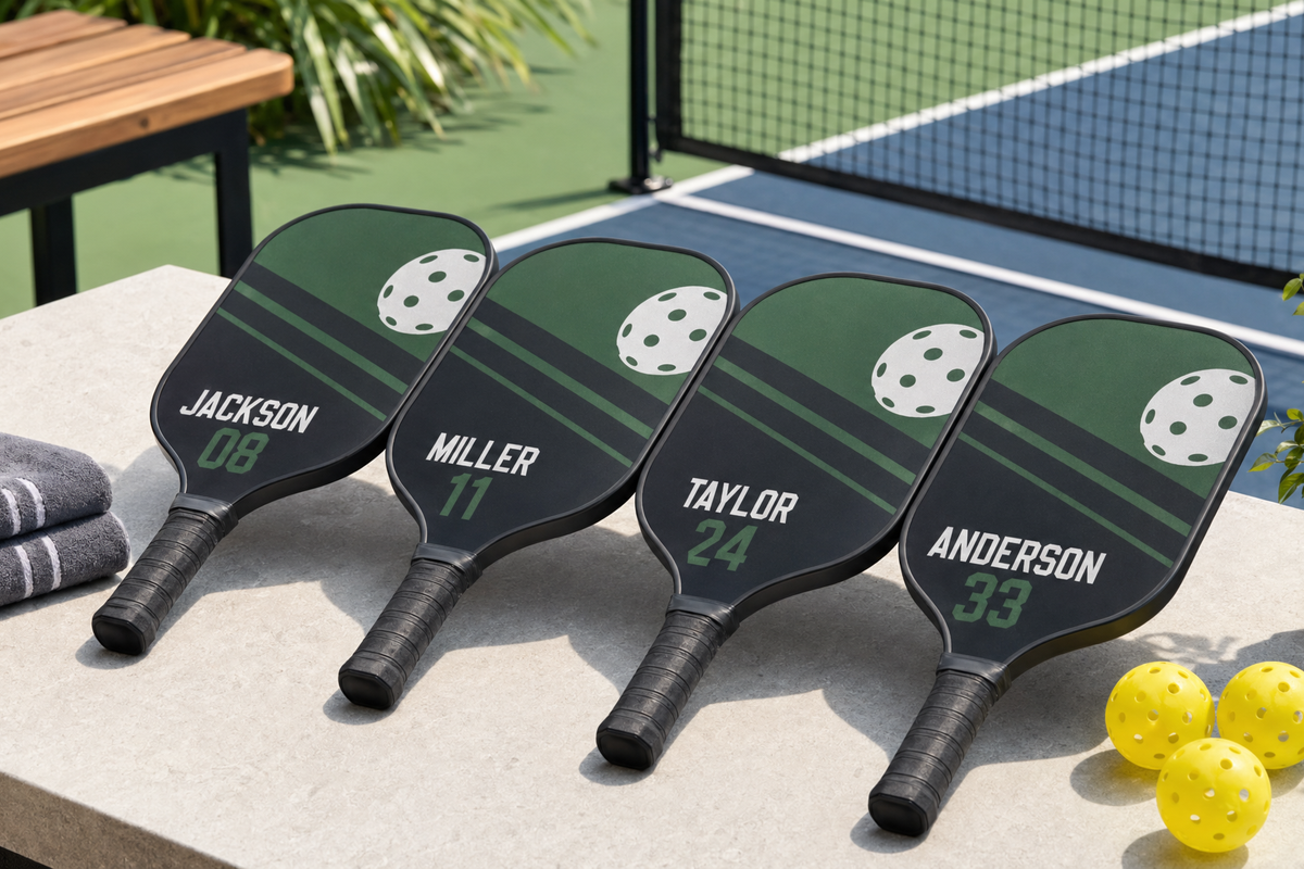
1. Jersey-inspired team paddle
Borrow the structure of a sports jersey: large team name, player number, and a clean secondary mark. This is one of the easiest concepts for a roster because each paddle can share the same background while changing the number and name for each player.
- Best for: league teams, clubs, school teams, and tournament squads.
- Personalization idea: front shows the team identity, back shows player name and number.
- Watch out for: tiny sponsor text or overly complex jersey textures that reduce readability.
2. Home-court map or city pride concept
A local map outline, city nickname, state shape, or court location can make the paddle feel rooted in a real place. This can be especially strong for clubs that play at a specific park, community center, or local league venue.
- Best for: local clubs, travel teams, and regional tournaments.
- Personalization idea: add the city, club name, and founding year.
- Watch out for: detailed maps with thin lines. A simplified map mark is usually more print-friendly.
3. Mascot pattern with one clear logo
If your team has a mascot, avoid turning the entire paddle into one crowded illustration. A better option is one primary mascot mark with a repeated pattern in the background. This gives the design energy while keeping the main identity readable.
- Best for: school teams, recreational leagues, and fun social teams.
- Personalization idea: use a small player nameplate near the handle area or on the reverse side.
- Watch out for: too many facial details or effects that become muddy at paddle size.
4. Roster-name collage
A roster-name design uses every player’s name as part of the graphic pattern. It can feel inclusive and gift-worthy, especially for end-of-season paddles. The key is to make the main team name larger than the surrounding names so the paddle still has a clear focal point.
- Best for: team gifts, club anniversaries, and commemorative paddles.
- Personalization idea: highlight the recipient’s name slightly larger or in a dedicated name bar.
- Watch out for: making every name the same size as the team name. That creates a texture, not a readable design.
5. Tournament edition paddle
For a team heading into a specific tournament, design the paddle around the event: team name, year, city, and tournament nickname. This approach turns the paddle into a memento without needing complicated artwork.
- Best for: tournament teams, charity events, corporate sports days, and family competitions.
- Personalization idea: add the event date and each player’s initials.
- Watch out for: overloading the design with long event names. Use a short event title and place details in smaller supporting text.
6. Captain and co-captain edition
If your team has leaders, create a small variation for captains. The overall design stays the same, but the back or lower section can say Captain, Co-Captain, Coach, or Founder. This makes the set feel organized without splitting the visual identity.
- Best for: clubs, office leagues, and recurring teams.
- Personalization idea: role title on one side, name on the other.
- Watch out for: creating too many versions. Keep the base design identical so the group still looks like a team.
7. Two-sided personality design
Many team concepts become stronger when each side has a job. One side can be clean and official. The other can be playful, personal, or event-specific. If you are exploring this route, read Lumo’s guide to a two-sided custom pickleball paddle for ideas on how to use both faces intentionally.
- Best for: gifts, family teams, social teams, and players who want personality without losing team unity.
- Personalization idea: front side has team logo; back side has player nickname, number, or short phrase.
- Watch out for: making both sides equally busy. One side should usually be the cleaner identity side.
8. Minimal crest design
A minimal crest can look polished without needing complex illustration. Use a shield, circle, badge, or monogram structure. Add the team initials, founding year, and a short wordmark. This is a good choice when the team wants a mature, club-like look.
- Best for: adult clubs, private groups, company teams, and premium gifts.
- Personalization idea: keep the crest fixed and change a small name or number field.
- Watch out for: very thin lines inside the crest. Simpler shapes are easier to recognize.
9. Retro athletic design
Retro athletic layouts use bold numbers, stripes, simple badges, and classic sports typography. They are useful when the team wants something fun but not overly cartoonish.
- Best for: mixed-age teams, clubs with a playful tone, and family tournaments.
- Personalization idea: player number large, team wordmark above, year below.
- Watch out for: distressed textures that may look intentional on a shirt but unclear on a paddle face.
10. Sponsor-friendly team paddle
If your team has a sponsor, the design needs discipline. Put the team identity first, then give the sponsor a defined placement. A sponsor mark should not crowd the player name or make the paddle feel like a flyer.
- Best for: local leagues, business-sponsored teams, charity events, and community competitions.
- Personalization idea: sponsor logo in a small lower section, player name on the back.
- Watch out for: adding multiple sponsor marks without a hierarchy. If everything is important, nothing is readable.
11. Rookie, veteran, or role-based series
Teams often have internal culture: rookies, veterans, captains, coaches, hype people, and doubles partners. You can reflect that with small role labels while keeping the base artwork consistent.
- Best for: social clubs, office leagues, and teams with recurring members.
- Personalization idea: role text such as Rookie Season, Veteran, Coach, or Doubles Partner.
- Watch out for: inside jokes that may age quickly. If the paddle is a gift, choose wording the recipient will still appreciate later.
12. Gift-set design with matching variations
For a family group, wedding weekend, reunion, or company retreat, a matching set can be more meaningful than one shared design. Use the same layout for everyone and personalize only the name, number, or phrase.
- Best for: gifts, reunions, corporate events, and holiday pickleball sets.
- Personalization idea: each paddle gets a name, while the group name and year stay fixed.
- Watch out for: asking every recipient to choose their own design. Too many individual choices can make the set look unrelated.

Design decision matrix: choose the right concept for your team
If your group is split between several ideas, use this matrix. It helps you choose based on the job the paddle needs to do.
| Team goal | Best design direction | Why it works | Keep it simple by |
|---|---|---|---|
| Look unified on court | Jersey-inspired or minimal crest | Strong identity, easy to repeat across a roster | Changing only names or numbers |
| Create a memorable gift | Roster collage or tournament edition | Captures a specific group, date, or season | Using one main title and short supporting text |
| Show personality | Two-sided personality design | One side can stay official while the other side feels personal | Assigning a clear role to each side |
| Represent a location | Home-court map or city pride | Makes the paddle feel connected to a real playing community | Simplifying maps and avoiding tiny street-level detail |
| Include sponsor branding | Sponsor-friendly layout | Balances sponsor visibility with team identity | Giving the sponsor a fixed secondary placement |
Print-readiness matters: make the idea easy to reproduce
A team paddle concept can look great on a screen and still create problems if the artwork is not prepared carefully. The most common issues are low-resolution images, important details placed too close to the edge, thin text, and layouts that depend on subtle details.
For image quality, Adobe’s print resolution guidance explains that print appearance depends on both image resolution and the physical size at which an image is printed. In plain terms, a small image pulled from a social profile may not hold up when enlarged for a product surface. You can review Adobe’s explanation here: Adobe resolution guidance for printing images.
Printful also explains the relationship between DPI, resolution, and actual print file size in its DPI and print file size guide. While exact requirements vary by product and production method, the practical lesson for team paddle buyers is consistent: start with the highest-quality original artwork you can access, not a screenshot, compressed thumbnail, or copied chat image.
Safe-area thinking for paddle layouts
Safe-area thinking means keeping the most important parts of the design away from edges and cut lines. Printful’s safe print area explanation is useful because it describes why critical text and artwork should not sit too close to the outside edge of a printable product area.
For team paddle designs, this matters most for names, numbers, dates, sponsor marks, and small logos. Background patterns can run wider. Critical identity elements should have breathing room.

A simple print-friendly checklist
- Use the original logo file when available, not a screenshot from a website or social media post.
- Keep player names short enough to read quickly. If needed, use first name plus last initial.
- Avoid very thin script fonts for names and numbers.
- Do not place important details directly at the paddle edge.
- Use high-contrast text over busy backgrounds.
- Choose one main focal point per side.
- Check spelling of every name before ordering.
One-sided or two-sided: how teams should decide
A one-sided design can be enough when the team has a simple logo and one shared design. A two-sided design becomes useful when the team wants both unity and personalization.
Here is a practical way to decide:
- Choose a one-sided concept if the paddle only needs a team logo, team name, and clean background.
- Choose a two-sided concept if you want the front to represent the team and the back to represent the individual player.
- Choose a two-sided concept if you are making gifts and want each recipient to feel seen without weakening the shared team identity.
For example, a company pickleball team might put the company team name and event year on one side, then put each employee’s name or department nickname on the other. A league team might put the crest on one side and the player number on the other. A family group might put the reunion name on one side and each person’s nickname on the back.
Common design mistakes to avoid
Most weak team paddle designs do not fail because the idea is bad. They fail because too many ideas are used at once. Before submitting artwork, run this short audit.
Mistake 1: treating the paddle like a poster
A paddle face is not a full event poster. If you add a long slogan, a roster, a date, a mascot, a sponsor, a city map, and a photo, the design will likely lose focus. Choose the most important message first, then support it with one or two secondary details.
Mistake 2: using photos without a clear subject
Photos can work for gifts, but group photos often become too busy. If you want a photo-based design, choose one image with a clear subject and enough empty space for text. For many team orders, a graphic concept is easier to repeat than a photo collage.
Mistake 3: making every paddle completely different
Full personalization is tempting, but if every player chooses unrelated colors, fonts, and artwork, the team set stops looking like a team set. A better approach is controlled variation: same template, personalized name or number.
Mistake 4: ignoring name length
Some names, nicknames, and team phrases are much longer than others. Test the longest name before approving the design. If the longest name works, the shorter names will usually be easier to place.
Mistake 5: putting important text too close to the edge
Edge placement often looks dramatic on a mockup, but it leaves less room for production tolerance. Keep names, numbers, dates, and logos comfortably inside the main visual area.
A buyer-friendly workflow for ordering team paddles
Once your concept is chosen, use a simple workflow so the order does not get stuck in group debate.
- Choose the base direction. Pick one concept from the list above: jersey, crest, tournament, roster, two-sided, or gift-set.
- Collect final text. Create a roster with exact spelling, names, numbers, nicknames, and role labels.
- Gather source artwork. Use original logos and high-quality images where possible.
- Decide what changes per paddle. Limit personalization to a few fields, such as name and number.
- Review one sample layout. Check hierarchy, readability, and safe placement before repeating it across the roster.
- Confirm order questions early. If you are unsure about customization details, review Lumo’s FAQs or contact Lumo before finalizing your group design.
Team paddle design brief you can copy
Use this short brief when organizing a team order or sending instructions to a designer.
Team name: [Team or club name]
Use case: [League / tournament / gift / company event / family group]
Primary identity: [Logo / mascot / wordmark / city / event name]
Personalized fields: [Player name / number / nickname / role]
Preferred concept: [Jersey / crest / two-sided / roster / map / retro]
Must include: [Year / location / sponsor / short phrase]
Must avoid: [Tiny text / long slogans / busy photo backgrounds]
Final roster: [List exact spellings]
Fit and not-fit: which idea should your team choose?
If you still are not sure, use this quick fit guide.
Choose a jersey-inspired design if...
- Your team wants the most recognizable sports look.
- You have numbers for each player.
- You want the set to look coordinated in group photos.
Choose a minimal crest if...
- Your team wants a cleaner, club-style identity.
- You do not have a mascot or detailed illustration.
- You want something that will not feel too tied to one joke or one event.
Choose a roster or tournament edition if...
- The paddle is mainly a keepsake or gift.
- The group wants to remember a specific season, tournament, or trip.
- You have a final roster and do not expect names to change.
Choose a two-sided design if...
- You want a team side and a personal side.
- You need space for both a logo and player information.
- You want the paddle to feel more giftable without making the front too crowded.
Concise FAQ
What is the best custom pickleball paddle design idea for a league team?
A jersey-inspired layout or minimal crest is usually the safest starting point. Both create a consistent team look and allow simple personalization such as names and numbers.
Should every team member get a different paddle design?
Usually, no. A more cohesive approach is to use one shared template and personalize only selected fields. This keeps the set recognizable while still making each paddle feel individual.
Can we use player photos on team paddles?
You can consider photo-based artwork, especially for gifts, but use high-quality source images and avoid crowded group photos. A clean graphic design is often easier to repeat across a full roster.
What information should we prepare before customizing?
Prepare the team name, exact player names, numbers or nicknames, logo files, preferred concept, event date if relevant, and any sponsor or location details. Confirm spelling before ordering.
Where should we start if we are ready to customize?
Start with Lumo’s custom paddle product page. If you need more process guidance, read the customization guide first.
References and useful reading
- Adobe: Resolution specs for printing images
- Printful: DPI, resolution, and actual print file size
- Printful: What is the safe print area?
Final takeaway
The best team paddle design is not the busiest design. It is the design that makes the team recognizable, gives each player a meaningful detail, and stays practical enough to reproduce cleanly. Start with the use case, choose one strong concept, protect the readable details, and keep personalization controlled. That approach gives your team a paddle set that feels intentional before anyone even steps onto the court.


Leave a comment
This site is protected by hCaptcha and the hCaptcha Privacy Policy and Terms of Service apply.