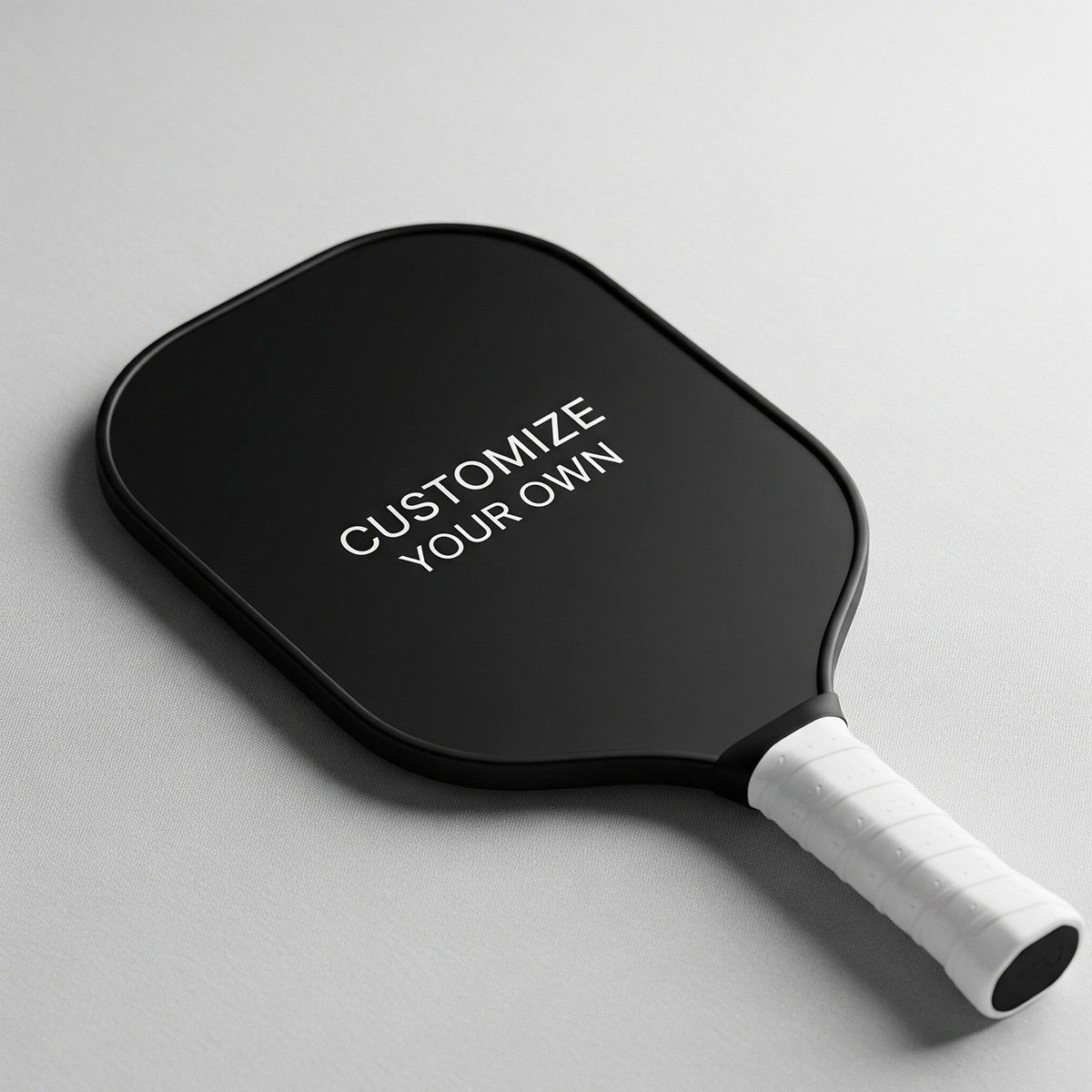
A photo custom pickleball paddle can be a great personal gift or a fun way to make your own gear feel unmistakably yours. It can also go wrong quickly if the photo is too small, the crop cuts into a face, the design is too busy, or the paddle is customized for the wrong kind of player.
This guide focuses on the main photo custom pickleball paddle mistakes to avoid before you upload an image or approve a design. The goal is simple: help you choose a photo, layout, and buying path that look good in real life, not just on your phone screen.
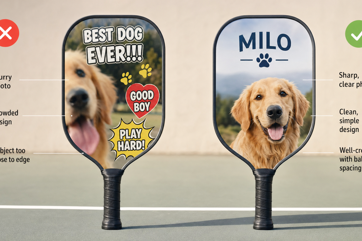
Quick answer: The most common mistakes are using a low-resolution image, choosing a photo that does not fit the paddle shape, placing important details too close to edges or the handle area, adding too much text, ignoring the second side, and customizing before deciding whether the paddle is for play, display, or gifting.

Start with the real buying question: what is this paddle for?
Before talking about pixels and layout, ask one practical question: is this paddle mainly for playing, gifting, display, or team identity? That answer changes what you should avoid.
- For regular play: prioritize a clean, readable design that still feels good to carry onto the court. Avoid tiny details that only work up close.
- For a gift: prioritize emotional clarity. One meaningful photo usually works better than a crowded collage.
- For display or keepsake use: you can be more sentimental, but you still need a photo that prints cleanly.
- For teams or events: consistency matters. Use similar crops, names, and layout rules across all paddles.
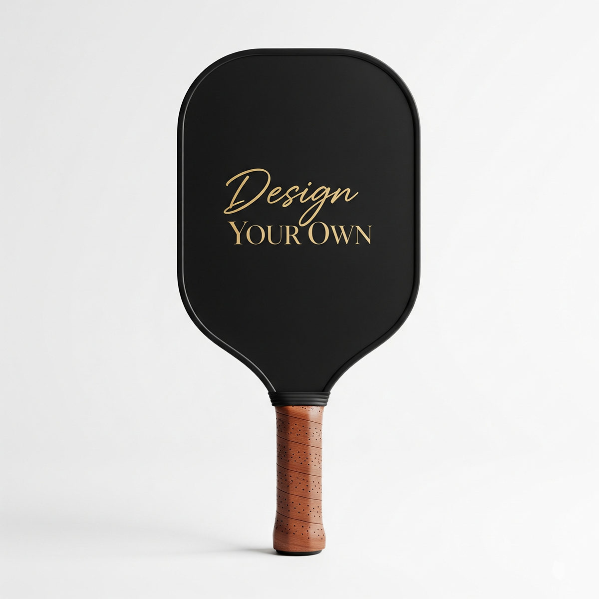
If you are still deciding whether a personalized paddle is the right route, Lumo has a helpful comparison in Custom vs Stock Pickleball Paddles: When You Should Customize and When You Shouldn’t. If you already know you want to create one, you can start from the custom pickleball paddle product page after working through the checklist below.
The photo paddle mistake audit
Use this table as a quick pre-upload audit. If any row describes your photo or design idea, fix that issue before ordering.
| Mistake | What it looks like | Better choice |
|---|---|---|
| Using a tiny or compressed photo | The image looks sharp on a phone but soft when enlarged | Use the largest original file available |
| Choosing the wrong crop | Faces, pets, or important objects are cut off by the paddle outline | Pick a photo with breathing room around the subject |
| Ignoring safe areas | Important details sit too close to the edge or handle zone | Keep faces, names, and dates away from trim-sensitive areas |
| Adding too much text | The paddle feels cluttered and hard to read | Use one short message, name, date, or phrase |
| Using a busy background | The subject blends into the background | Choose a cleaner photo or simplify the design |
| Forgetting the second side | One side feels finished; the other feels like an afterthought | Plan front and back together |
| Designing only for close-up viewing | The paddle looks good in preview but weak from a few feet away | Use clear focal points and strong visual hierarchy |
| Skipping gift context | The photo is meaningful to you but not clearly meaningful to the recipient | Match the design to the recipient’s personality and playing habits |
Mistake 1: using a photo that is too small for the final design
The first technical mistake is assuming that any photo that looks good on a phone will look good when printed across a paddle face. A phone screen is forgiving. A printed product is less forgiving because the file may need to be enlarged, cropped, and processed.
General print guidance from Adobe explains that resolution affects how much image detail is available for printing. Adobe’s resolution guidance for print images is not specific to pickleball paddles, but the principle is useful: higher-quality source files give the design process more information to work with.
Printful also explains the relationship between DPI, resolution, and actual print file size in its DPI and print file size guide. The practical takeaway for shoppers is not to obsess over a single number in isolation. Instead, check whether your image is large enough for the area you want to cover and whether it still looks sharp when viewed at the intended size.
How to reduce the risk
- Use the original photo file when possible, not a screenshot from social media.
- Avoid heavily filtered or repeatedly compressed images.
- Zoom in before uploading. If the face, pet, logo, or object already looks fuzzy, printing will not magically fix it.
- If you want a full-paddle photo background, choose a stronger file than you would need for a small corner image.
A lower-quality image may still work if it is used smaller, placed inside a simple layout, or treated as a background element. The mistake is forcing a weak image to carry the entire paddle.
Mistake 2: choosing a photo that does not fit the paddle shape
A paddle is not a rectangle. It has rounded edges, a handle, and a playing surface that creates a specific visual frame. A photo that looks perfect as a horizontal landscape image may not fit well when placed on a paddle.
The most common crop problems are easy to predict:
- A person’s head sits too close to the top edge.
- A pet’s ears or tail fall outside the usable area.
- A group photo becomes too small because everyone must fit.
- A vertical portrait leaves awkward empty areas on the sides.
- A landscape photo loses its best detail when cropped into the paddle outline.
For a one-person or one-pet design, choose a photo with space around the subject. For a couple or family design, avoid photos where people are already tight against the frame. For a scenic photo, make sure the strongest visual detail is not only at the far left or far right.

Mistake 3: putting important details too close to the edge
Safe area is a general print concept that matters whenever a design is applied to a physical object. Printful’s safe print area guidance explains why important design elements should stay inside safer zones rather than sitting on the outer edge. While that article is not written specifically for pickleball paddles, the principle applies well to custom products: leave margin for production realities.
On a photo custom pickleball paddle, the details most worth protecting are faces, pet faces, names, dates, short messages, team names, and any design element that would look strange if clipped. Background texture can usually extend closer to the edge. Essential details should not.
A simple safe-area rule for shoppers
When reviewing a design preview, imagine that the outermost edge is less reliable than the center. If cutting off a small part of the element would ruin the design, move that element inward or make it smaller. This is especially important near the handle, where the paddle shape changes and visual space becomes tighter.
Mistake 4: treating text like a poster instead of a paddle detail
Text can make a photo paddle more personal, but too much text turns the design into a crowded poster. A paddle is held, swung, leaned against a bag, and viewed from different distances. Long messages often lose impact.
Better text choices include:
- A first name or nickname
- A short phrase
- A date with clear meaning
- A team name
- A simple inside joke
Riskier text choices include long quotes, multiple fonts, paragraph-length messages, tiny captions, and text placed over detailed backgrounds. If the words matter, give them a clean area to live in. If the photo matters more, keep the words minimal.
For visual inspiration that does not rely on overcrowding, see Lumo’s pickleball paddle design ideas. Use the ideas as direction, not as a reason to add every possible element at once.
Mistake 5: using a photo with a distracting background
The best photo for a custom paddle is not always the most emotional photo in your camera roll. Sometimes the meaningful photo has poor lighting, a cluttered room, people in the background, or objects cutting through the subject. Those distractions can become more obvious on a physical product.
As a practical rule, the subject should be easy to identify within one second. If a viewer has to search for the person, pet, or moment, the design may be too busy.
Good photo candidates
- A clear portrait with natural spacing around the subject
- A pet photo with sharp eyes and a simple background
- A couple or family photo where faces are close enough to read clearly
- An action shot with one obvious focal point
- A clean travel or court photo with space for a short name or date
Photos to be careful with
- Large group shots with many small faces
- Night photos with heavy grain
- Social media downloads or screenshots
- Images with important details at the edge
- Photos where the background is brighter or busier than the subject
Mistake 6: forgetting that front and back can solve different jobs
A two-sided design gives you more room to make smart choices. One side can carry the main photo. The other can carry a name, number, date, team mark, pattern, or simpler graphic treatment. The mistake is trying to force every meaningful detail onto one side when the design could breathe better across both sides.
If you are considering a two-sided layout, Lumo’s guide to a two-sided custom pickleball paddle is a useful next read. The key idea for shoppers is to plan both sides as one object, not two unrelated images.
For example, a gift paddle might use a favorite dog photo on one side and the dog’s name with a simple pattern on the other. A team paddle might use a logo-style design on one side and each player’s name on the other. A couple’s gift might use a photo on one side and a short date or phrase on the other.
Mistake 7: choosing the photo before choosing the gift message
For gift buyers, the emotional message should guide the design. Many shoppers start with the first cute or funny photo they find. That can work, but it can also produce a paddle that feels random.
Ask these questions before choosing the image:
- What will the recipient understand immediately?
- Is the paddle meant to be funny, sentimental, bold, sporty, or understated?
- Will the recipient actually want to bring this design to the court?
- Would a name, date, or short phrase make the photo more meaningful?
- Is there a better photo that tells the story with less explanation?
If the paddle is a birthday, holiday, retirement, team, or family gift, start with Lumo’s custom pickleball paddle gift ideas with photos. It can help you choose a design direction before you commit to one image.
Mistake 8: assuming a custom paddle is always the right choice
Customization is valuable when it adds meaning. It is less useful when a shopper wants the fastest possible option, has no suitable image, or needs a very specific performance setup they have not researched yet. A custom paddle should be chosen intentionally, not because personalization is available.
A photo custom paddle is usually a good fit when:
- You have a clear, high-quality photo.
- The recipient enjoys personal or playful gear.
- The design has a simple message.
- You want a memorable gift connected to pickleball.
- You are willing to review the crop and layout before buying.
It may not be the right fit when:
- The only available photo is blurry or very small.
- The recipient strongly prefers plain gear.
- You are unsure whether the design would be appropriate on court.
- You are buying under extreme time pressure and cannot review details carefully.
If you want a smaller personalized add-on instead of a full paddle, a custom pickleball paddle replica keychain can be a lighter gift idea or companion item.
Mistake 9: skipping a final preview check
The last check is not about taste. It is about catching preventable issues before they become part of the finished product. A few minutes of review can prevent the most frustrating mistakes.
Final preview checklist
- Subject clarity: Can you identify the person, pet, or object immediately?
- Face safety: Are faces away from edges, corners, and the handle area?
- Text readability: Is the text short, large enough, and placed over a clean area?
- Crop quality: Does the image still look sharp after cropping?
- Design balance: Does one side feel overcrowded while the other feels empty?
- Recipient fit: Would the recipient enjoy using or displaying this design?
- Purpose match: Does the paddle match the goal: play, gift, keepsake, or team identity?
If you want a broader walkthrough of the customization process, read How to Customize Your Pickleball Paddle: The Complete Guide. Use this mistake list alongside that guide when preparing your image.
A practical decision framework: keep, crop, simplify, or replace
When you are unsure about a photo, do not ask only whether you like it. Ask what action the photo needs.
| Photo situation | Best action | Why |
|---|---|---|
| Clear subject, high-quality file, extra space around edges | Keep | Likely to adapt well to paddle layout |
| Good subject but too much empty background | Crop carefully | The design can focus attention without losing detail |
| Meaningful photo but busy background | Simplify layout | Use less text and keep the photo as the main element |
| Small, blurry, or screenshot-only image | Replace if possible | Weak source files are hard to rescue |
| Group photo with many small faces | Use a different design idea | Small faces often lose clarity when fitted to a paddle |
Where Lumo fits into the buying process
Once you have a strong image and a clear design goal, the next step is to build the paddle with fewer surprises. You can explore the Lumo custom pickleball paddle, compare design directions, and use the guides linked above to decide whether a photo-first, text-first, or two-sided design makes the most sense.
The best custom paddle usually does not come from adding more. It comes from choosing one strong photo, protecting the important details, and giving the design enough space to feel intentional.
Concise FAQ
Can I use a screenshot for a photo custom pickleball paddle?
It is safer to use the original image file when possible. Screenshots and social media downloads are often smaller or more compressed than the original photo, which can increase the risk of a soft-looking print.
Is one photo or a collage better?
For most shoppers, one strong photo is easier to make readable on a paddle. A collage can work, but it increases the risk of tiny faces, clutter, and awkward cropping.
Should I put text on the same side as the photo?
Only if the text is short and has a clean area to sit on. If the photo is detailed, consider placing the name, date, or phrase on the second side instead.
What is the safest photo type to choose?
A sharp portrait, pet photo, or simple action image with extra space around the subject is usually safer than a dark, crowded, or tightly cropped photo.
What should I do if my favorite photo is low quality?
Consider using it smaller, pairing it with a simple layout, or choosing a different photo. If the image is already blurry before upload, enlarging it for a full paddle design is risky.


Dejar un comentario
Este sitio está protegido por hCaptcha y se aplican la Política de privacidad de hCaptcha y los Términos del servicio.